St. Petersburg, Russia Olympic Bid Logo

Primary Logo

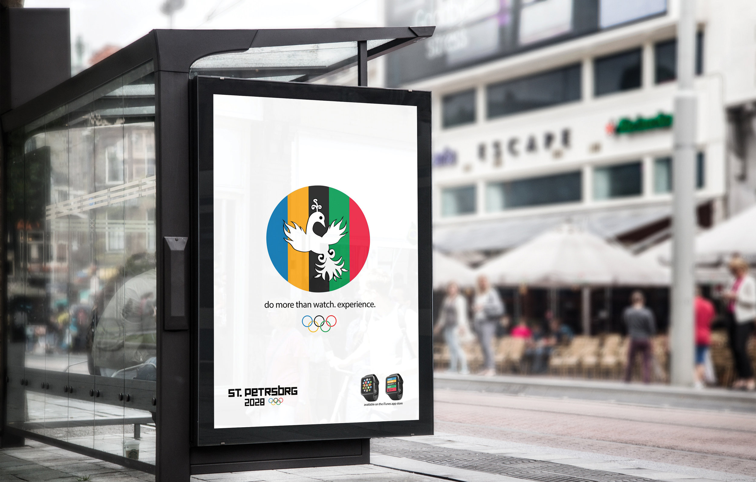
Secondary Logo
The objective was to design a logo for Saint Petersburg, Russia as an applicant city for the 2028 Summer Olympics. The logo needed to highlight Saint Petersburg as a potential host city and encompass Russian culture. In addition, the logo had to be versatile for multiple digital and print platforms. It had to be adaptable to additional color schemes including the Olympic color palette. Research revealed that imagery from Russian folklore was incorporated in traditional crafts and architecture. The firebird, also known as a phoenix was featured in many Russian folklore where the glowing feathers were often the subject of a quest. The act of a quest was symbolic of the history behind the Olympic Games. The popular ballet titled “The Firebird” Russian composed by Igor Stravinsky who was inspired by the folklore creature. the firebird embodied the potential host city because of Saint Petersburg is known for having one of the best ballet schools in the world.
The firebird was an easily identifiable figure internationally that was stylized to reflect the aesthetic of Russian folklore. The creature is described as a peacock like bird with glowing eyes and feathers that glow yellow, orange and red. The color palette was influenced by patterns and images in Russian folk art. The choice of a warmer color palette was representational of the summer Olympics. The wings of the firebird were described as flames which was reminiscent of the Olympic torch. The folklore surrounding the firebird and its glowing feathers was a metaphor for the journey of each athlete took in hope of winning gold. The typeface used in the combination logo was a heavy sans serif. The square type was reminiscent of Constructivist typography often used in Russian art and propaganda posters during the mid-twentieth century. Constructivist art movement also influenced the designers outside of Russia. The decision to shorten ‘Petersburg’ was to prevent the logo from being too rectangular. The first vowel remained to ensure readability.