Fight Club
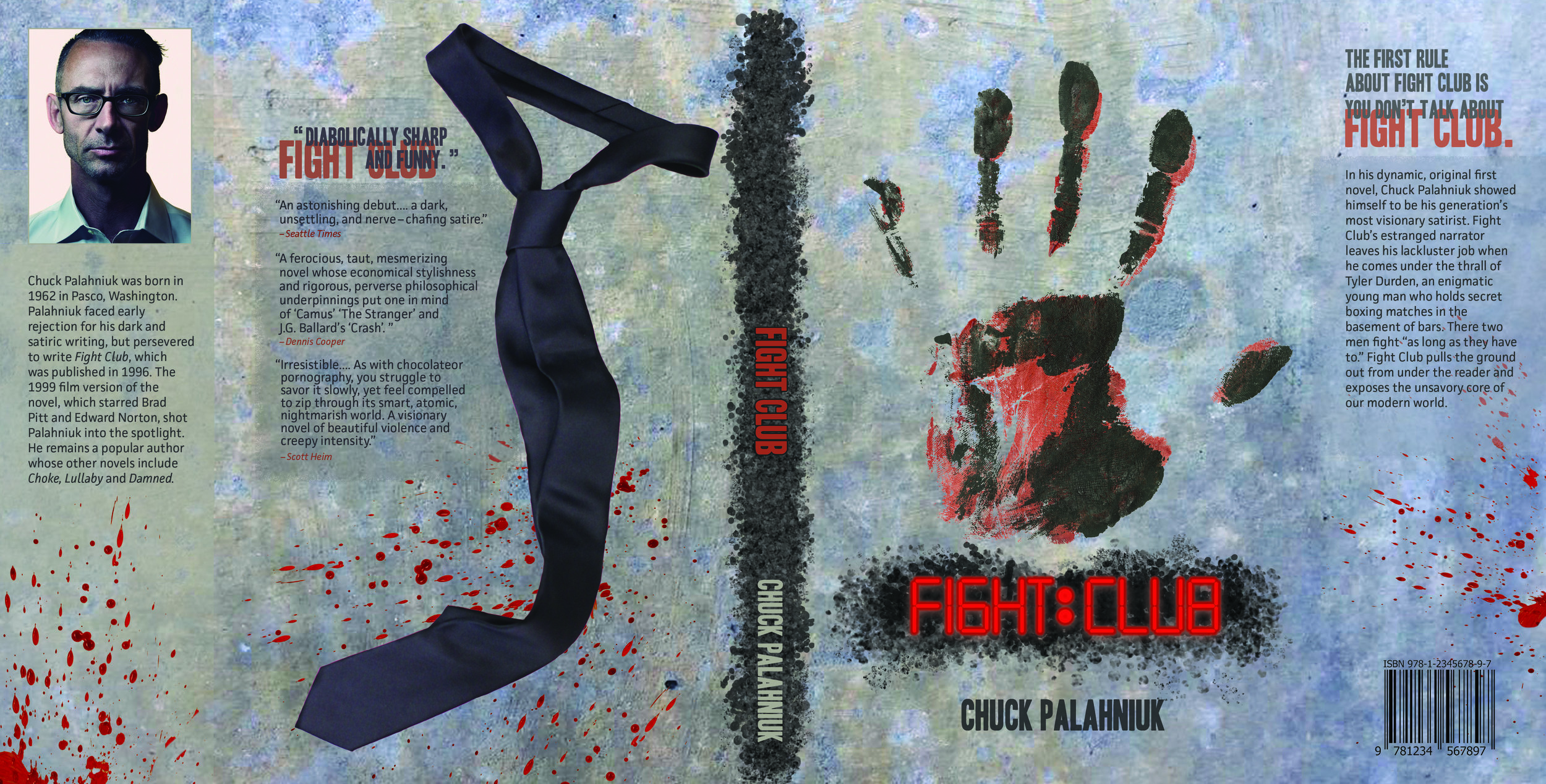
The three deliverables were designed to serve as promotional materials for the movie Fight Club. The movie a was adaption of Chuck Palahniuk’s novel about an insomniac who started an underground fight club and a domestic terrorist group called Mayhem Project with his friend Tyler. Jack’s discovery that Tyler is really a delusion of himself revealed his depth of denial and insanity. The strategy was to express the creation of Tyler and the evolution of the Jack through the use of the textures and colors from the environment.
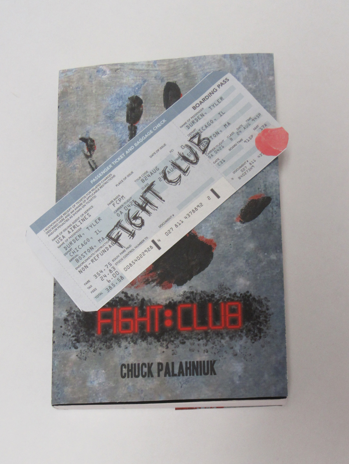
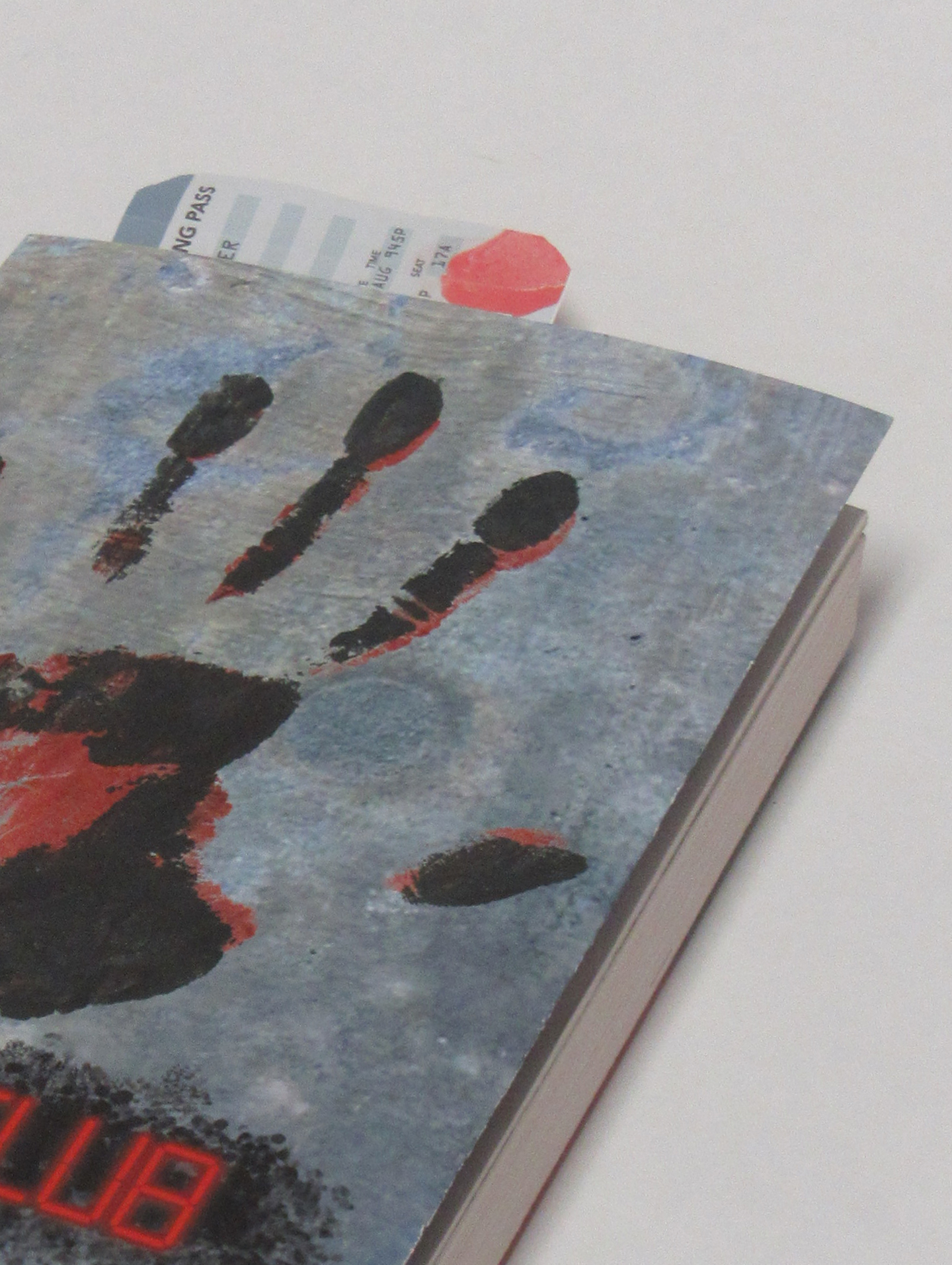
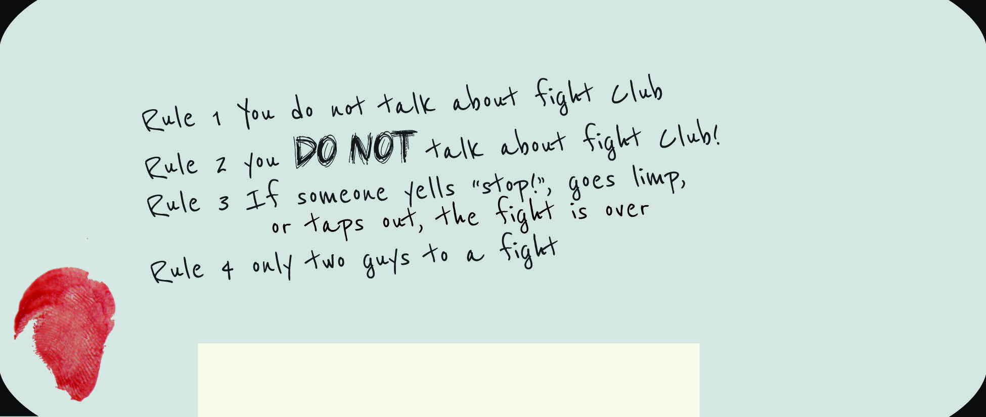
A dark color scheme consisted of greys, blues, reds and taupe was chosen from movie stills. The textured concrete used as the background was selected to mirror the coldness of the destressed environment. The title was an original typeface design inspired by the digital clock on a bomb found in the van at the climax of the storyline. The bomb itself was a metaphor for the main character’s self-destruction. In Fight Club, the perception of blood and violence was skewed by the characters use of fighting as an adrenaline rush. The doubled hand print in black ink and blood colored paint feature as a focal point for the front book cover and movie poster to symbolize the dueling personalities of the main character. A navy blue tie placed on the book’s back cover to signify the degeneration of Jack’s initial identity of a car company recall specialist.
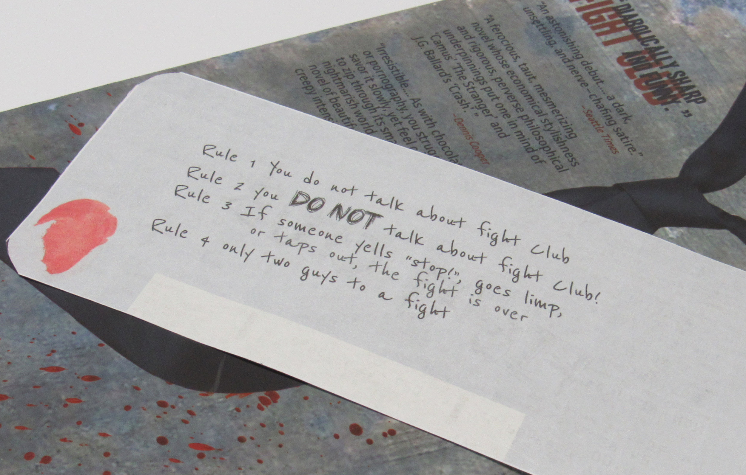
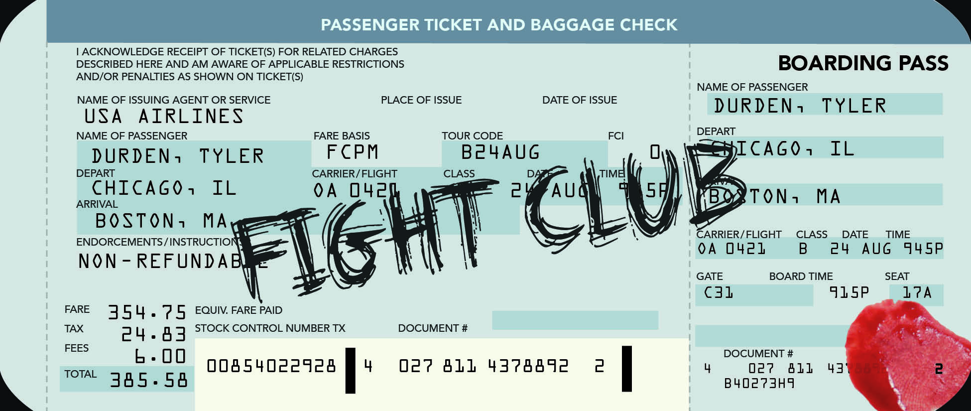
The use of a plane ticket as a book mark referenced how airplane travel was used as a plot device to signal transition. Tyler was first introduced on an airplane, the later Jack flies to follow all the places Tyler has been before realizing the truth. The ticket creates a more intimate connection with the viewer with the use of handwriting and bloody fingerprints.